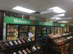
The picture listed above shows examples of both serif (“Heineken”) and sans-serif (“Welcome to Bill’s Liquors”) fonts.
While the design of your commercial graphics is definitely an important element, the font you choose for your lettering is just as important for business. Font choice can be the difference between someone taking the time to read your graphic and someone overlooking it. Here are some tips for choosing fonts for your commercial graphics.
Serif vs. Sans-Serif
The first thing you should decide when choosing a font is if you want serif or sans-serif. Serif fonts have a small line tailing each stroke in a letter and are generally considered to be more decorative fonts as well as easier to read. These are fonts like Cambria and Times New Roman and are best used for print and signage. Sans-Serif fonts don’t have the extra lines attached and provide a cleaner look. These fonts are good for smaller print because their simplicity makes them easy to read and translate, making them good for online work. Some popular Sans-Serif fonts are Arial and Calibri.
What Style are You Going For?
When it comes to choosing fonts for your commercial graphics, it really depends on the style, mood, and message you are trying to convey with your graphic. Here are some style examples and which fonts are best suited for them:
- Modern: The modern look is in and to accommodate that, it is best to look for a geometric san-serif font. These fonts give a clean, clear, minimalist look to commercial graphics. Examples include Futura, Gotham, and Helvetica.
- Bold: When you are trying to make a bold statement, go for block font styles. These are good for headlines because of the fact that they stand out. Some good examples to use are Freshman and Richardson. You can also just take any font you like and put it in bold print to give off the same dramatic effect.
- Simple: If you want to keep your commercial graphics nice and simple, a humanist sans font is a great option. They are considered humanist because these fonts are made from handwriting, giving them a more realistic look. Fonts such as Myriad, Slate, and Verdana fall into this category.
Contact Brand It Wrap It Today for Your Commercial Graphics!
If you are looking for a cool custom way to decorate your vehicle or advertise your business, make sure to check out Brand It, Wrap It, Custom Signs and Vehicle Graphics. We are a full-service sign and wrap company that provides excellent quality signage for businesses both big and small throughout the Maryland, Virginia, and Washington, D.C. metro area. We provide awesome customer service, use the best and latest sign printing technology, and pride ourselves on our attention to detail. To see how we can help your business shine, give us a call at 301-838-9727 or visit us online for an estimate. For more tips and articles like this, follow us on Facebook, Twitter, Google+, Pinterest, andInstagram.