The design elements of your car wrap, such as the colors and fonts, can make or break your advertising campaign.
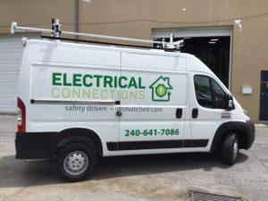
No matter the size of your business, effective marketing is vital in increasing brand awareness, generating profit, and building a loyal customer base. Also, it is a great way to build a positive reputation for your business. Many business owners opt for car wrap advertising as it has a significant impact on their target audiences. Your vehicle graphics need to be eye-catching and memorable, so it speaks to your customers. The design elements of your car wrap, such as the colors and fonts, can make or break your advertising campaign. Here are some design tips for your car wrap fonts.
Think About Your Target Audience
Considering the audience you are trying to attract will help you determine your car wrap design. You can add specific colors, fonts, or graphics to your vehicle wrap to catch the attention of potential customers. For instance, if you have a tutoring business, using pencils to cross your “T”s adds a charming flair to your design.
Consider the Size of the Font
Generally, larger fonts are considered easier to read. But, there are still variations and exceptions to that rule. A complicated font will be harder to read than a simple one, even if the text size is large. Any font that uses both thick and thin lines will be more difficult to read. Some general guidelines to keep in mind are:
- 3” letters can be read up to 25 feet away
- 6” letters can be read from more than 33 feet away
Remember that people will be viewing your graphic while it is moving, so try to keep the lettering and designs as simple as possible.
Serif vs. San Serif
It is very important that your graphic is readable. Specific fonts can make the wording harder to read, thus impacting your business. Let’s look at serif versus sans serif fonts. Serif fonts have a small stroke at the end of each letter. This extra line makes them easier to read within large amounts of text because the serif leads the eye along the line.
On the other hand, sans serif fonts do not have extra embellishments. This makes san serif fonts easy to recognize, especially at a glance. Using a sans serif typeface will allow potential customers to read your design easily as it drives down the highway.
Contact Brand It Wrap It Today
If you are looking for a cool custom way to decorate your vehicle or advertise your business, make sure to check out Brand It, Wrap It, Custom Signs, and Vehicle Graphics. We are a full-service sign and wrap company that provides excellent quality signage for businesses both big and small throughout the Maryland, Virginia, and Washington, D.C. metro area. We provide customer service, use the best and latest sign printing technology, and pride ourselves on our attention to detail. To see how we can help your business shine, give us a call at 301-838-9727 or visit us online for an estimate. For more tips and articles like this, follow us on Facebook, Twitter, Pinterest, and Instagram.